

.avif)


A leadership meeting is in twenty minutes and someone just asked for the procurement dashboard. If that request sends anyone digging through three spreadsheets and a Slack thread, the problem isn't the meeting. It's that the "dashboard" was never actually a dashboard.
What is a procurement dashboard?
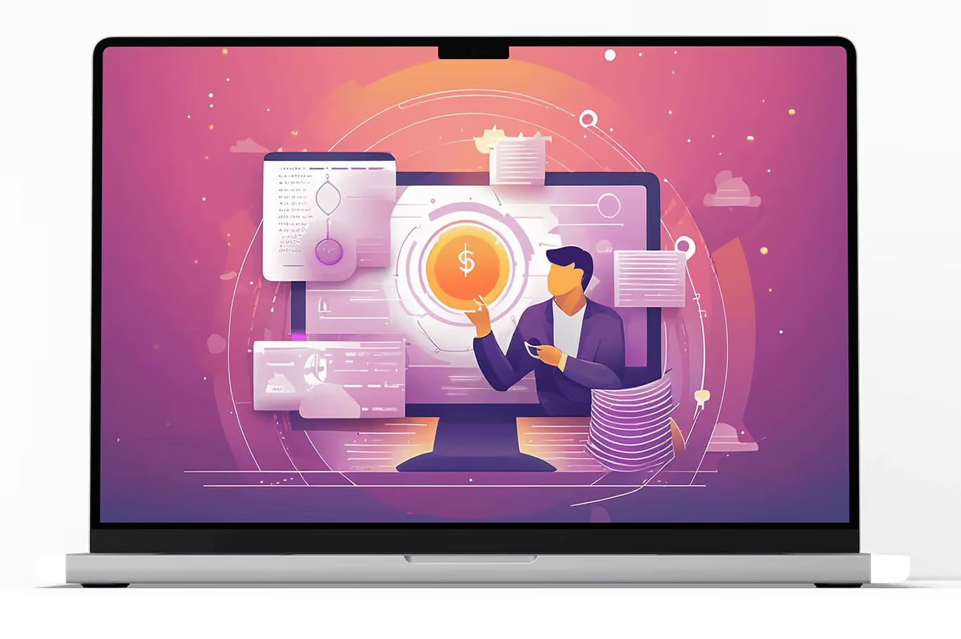
A procurement dashboard is a live, visual view of procurement performance, spend, savings, cycle time, vendor performance and compliance, pulled from real data rather than rebuilt by hand each time someone asks for it. It's the display layer on top of your procurement KPIs: the KPIs are what you measure, the dashboard is how you see them without asking someone to go find the numbers first.
The distinction that actually matters isn't visual polish. It's whether the thing updates on its own. A dashboard that's really a monthly export with a nicer template is still a manual report wearing a dashboard's name.
Why most procurement dashboards fail
Most procurement dashboards don't fail because the charts look bad. They fail for three specific, recurring reasons.
- Fragmented data sources. Spend data lives in the ERP, contract data lives somewhere else, vendor performance lives in someone's inbox. A dashboard built on top of that fragmentation just visualizes the mess faster; it doesn't fix it. Real visibility requires the underlying data to actually be connected first.
- Tracking too many metrics. A dashboard with thirty tiles looks impressive and gets read by nobody. The same discipline that applies to picking KPIs, a handful tied to real decisions, applies twice as hard to what actually earns a spot on the dashboard itself.
- Static reports mistaken for dashboards. A PDF exported on the first of the month is already stale by the fifteenth. If a number on the dashboard doesn't reflect what's true right now, it's a report, not a dashboard, and it should be labeled that way so nobody makes a decision on data that's already out of date.
What metrics belong on a procurement dashboard?
Start narrow. Cost savings rate, spend under management, purchase price variance on the cost side; OTIF delivery rate, supplier defect rate and contract compliance rate on the risk side, the same six-KPI starter set covered in our procurement KPIs guide, is enough for a first dashboard that someone will actually check regularly. Expand from there only once those six are reliably measured and someone is acting on what they show.
How do you build a procurement savings dashboard?
A savings dashboard is the single most requested view in procurement, and the one most likely to get challenged in a review, because "savings" means different things to different people until the dashboard forces a single definition.
- Pick one baseline definition and stick to it. Realized savings should be measured against a documented baseline price or a previous contract term, not a list price nobody intended to pay. The same baseline rule from the procurement KPIs guide applies here with extra force, since a savings dashboard is exactly what gets put in front of a CFO.
- Separate realized savings from cost avoidance. Both are real value, but they're not the same thing, and blending them into one number is the fastest way to have a savings figure someone doesn't trust. Show them as two distinct tiles, not one combined total.
- Track cumulative and period savings separately. A single quarter's number tells you if this quarter went well. A running total tells you whether the program is actually working over time. A dashboard needs both, since one without the other tells an incomplete story either way.
- Tie savings to the category or vendor that generated it. A total savings number with no breakdown by category or vendor is hard to act on. Knowing which specific negotiation or contract change produced the number is what makes the dashboard useful for deciding what to do next, not just what to report.
What makes a procurement dashboard actually get used, not just built?
A dashboard nobody opens is a wasted build, however good the underlying data is. A handful of design decisions separate the two outcomes.
- Match the dashboard to who's actually looking at it. BI teams generally group dashboards into four types: operational (near real-time, day-to-day), tactical (department-level, weekly to monthly), analytical (trends and root causes over a longer window) and strategic (executive-level, tied to long-term goals). A category manager needs something closer to operational. A CFO needs something closer to strategic. Building one dashboard and hoping it serves both is usually why neither audience finds it useful.
- Build in drill-downs, not just totals. A number someone can click into to see what's behind it gets trusted. A number that's just displayed with no way to investigate it gets questioned the first time it looks unusual.
- Add benchmark context, not just the raw figure. A cost savings rate of 7% means very little on its own. The same number next to a benchmark, your own historical trend or an external reference point, tells you immediately whether that's good or a warning sign.
- Automate the data pull. Every manual step between the source system and the dashboard is a place the number can lag, get entered wrong, or simply not get updated the week everyone's busy. This is the difference between a dashboard and a slide someone rebuilds monthly.
How Flo keeps a procurement dashboard live instead of static
Flo Procure's dashboard reflects what's actually happening because the underlying data is generated by the same system doing the work, not exported from it afterward.
- Real pricing benchmarks give the savings dashboard a defensible baseline instead of an inflated list price
- Every approval, purchase order and invoice match updates the dashboard the moment it happens, so the number in the meeting matches the number in the system
- Renewal Agent and Contract Agent keep compliance and contract metrics current, instead of reflecting terms that changed months ago
- Views can be scoped by role, so a category manager and a CFO aren't stuck looking at the same dashboard built for someone else's job
Frequently asked questions about procurement dashboards
1. What is a procurement dashboard?
A procurement dashboard is a live, visual view of procurement performance metrics, spend, savings, cycle time, vendor performance and compliance, pulled from real data rather than rebuilt manually each time someone needs it.
2. What's the difference between a procurement dashboard and a procurement report?
A report is a static snapshot from a specific point in time. A dashboard updates continuously and reflects current data whenever someone looks at it. Many things called "dashboards" are actually just reports with a better layout.
3. How do you build a procurement savings dashboard?
Start with one clear baseline definition for savings, separate realized savings from cost avoidance instead of blending them, track both cumulative and period totals, and break the number down by category or vendor so it's actionable, not just reportable.
4. What are the four types of dashboards?
Operational, tactical, analytical and strategic. Operational dashboards track near real-time activity, tactical dashboards cover department-level performance over weeks to a quarter, analytical dashboards surface trends and root causes, and strategic dashboards support long-term, executive-level decisions.
5. Can AI build a procurement dashboard for you?
AI can generate a chart or a mockup quickly, but a real procurement dashboard needs to pull from governed, connected data, spend, contracts, approvals, that AI alone doesn't have access to. The harder problem is the data connection, not the visualization, and that's where most "AI-generated dashboard" demos fall short of an actual working one.
6. How often should a procurement dashboard update?
For most core metrics, in real time or close to it, since the entire value of a dashboard over a report is that it doesn't go stale. Metrics genuinely dependent on periodic external data, like a quarterly benchmark comparison, are the exception.
7. Who should have access to a procurement dashboard?
Access should scope to role, not just seniority. A category manager needs granular, near-real-time detail on their categories. A CFO needs a trend-level, strategic view. Giving both the same dashboard usually means building something too detailed for one and too shallow for the other.
8. What's the difference between a procurement dashboard and a vendor dashboard?
A procurement dashboard covers your function's overall performance: total spend, savings, cycle time, compliance. A vendor dashboard narrows in on one or more specific suppliers: their delivery record, defect rate, and SLA history. Most procurement dashboards include a vendor-performance section, but a dedicated vendor dashboard goes deeper on any single supplier than a general overview needs to.


-compressed.avif)












.avif)
.avif)